Data Visualization Chart Cheatsheets (ML4Devs, Issue 6)
Originally published at ML4Devs.com. See all issues at https://www.ML4Devs.com/newsletter/
When you see informative charts and infographics, what is your first reaction? I wonder how you decide which chart type to use.
In this issue, I will share some of the best resources I found.
The Extreme Presentation Method
The Extreme Presentation Method by Dr. Andrew V. Abela is probably the most popular Chart decision tree around. The first step is to focus on your purpose. What do you want to show: Comparison, Distribution, Composition, or Relationship? And then pick a chart type depending upon the number of variables, and whether one of them is time.
This works quite well in picking a reasonably good chart, though there has been some critique too.
Data Story: A Visualization Decision Tree
Here is another popular visualization decision tree. It too starts with the purpose. It appears a bit more complex than the previous method but is still quite simple and straightforward.
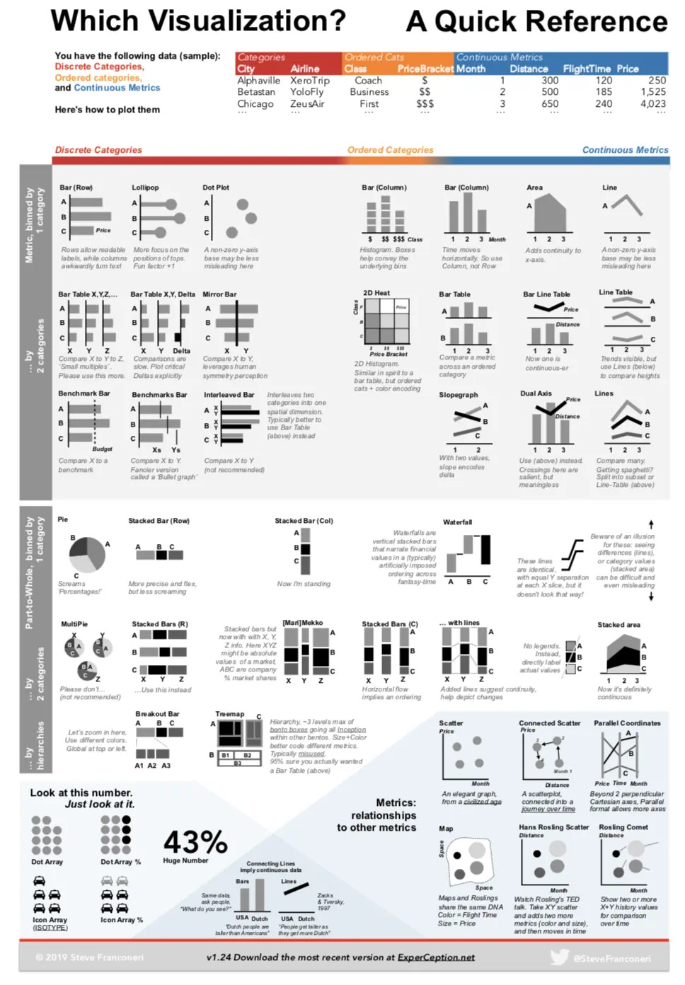
Which Visualization? — A Quick Reference
Another way to start with the type of data: do you have discrete categories, ordinal data, or continuous data? Though this method to choose a visualization appears to be a bit more complex, it is mostly due to the details.
Choose Your Visuals
Here is another (and simpler table) for how to choose your visuals:
Comparison: Bar Chart, Grouped Bar, Line Chart, Bubble Chart, Area Chart, Stacked Bar, Ribbon, Shape Map, Donut, Treemap
Data Over Time: Bar Chart, Line Chart, Stacked Bar, Area Chart, Stacked Area, Bubble Chart, Waterfall
Correlation: Bubble Chart, Column Line, Scatterplot
Distribution: Bubble Chart, Grouped Bar
Part-to-Whole: Donut, Stacked Bar, Treemap
Ranking: Ordered Column, Ordered Bar, Ribbon, Decomposition Tree, Funnel
From Data to Viz
From Data to Viz decision tree guide that “leads you to the most appropriate graph for your data.” It has quite a rich set of charts. The decision tree is a bit of a hybrid, it uses data type as well as broad application (map, network, time-series) to select the right visualization.
Datacamp Data Viz Cheatsheet
Datacamp Data Viz Cheatsheet uses the purpose as the first decision point and is more descriptive.
Python Data Visualization Catalogs
Apart from these decision trees, I do look at the following when doing data visualization using Python:
Python Graph Gallery is an excellent source: https://python-graph-gallery.com/
Seaborn Gallery to quickly look for code snippets: https://seaborn.pydata.org/examples/
Matplotlib gallery is exhaustive, but useful if you know what you are looking for: https://matplotlib.org/stable/gallery/
Over a period of time, you most likely will have your favorite charts at your figure tip.
Interactive Data Apps
Sometimes, it is better to have an interactive data app instead of a. static chart. Following are the most popular tools for that purpose:
Streamlit: https://streamlit.io/
Plotly Dash: https://plotly.com/
Panel: https://panel.holoviz.org/
Bokeh: https://bokeh.org/
Jupyter Voila: https://voila.readthedocs.io/
ipywidgets: https://ipywidgets.readthedocs.io/


